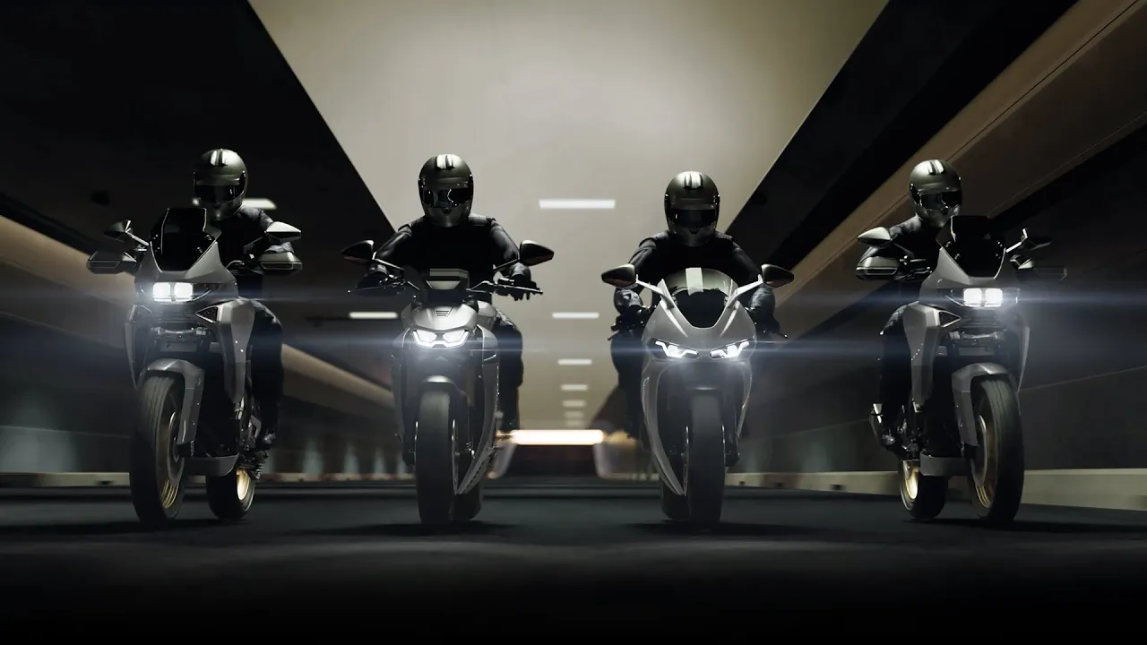
Revamped digital experience led to 38% more inquiries and engagement.
Industry
Automotive
Client
Norton Motorcycles (TVS)
Role
Research, Design system setup, Visuals & Prototyping
Duration
8+ weeks

Overview
Reviving a legend : Norton’s digital renaissance
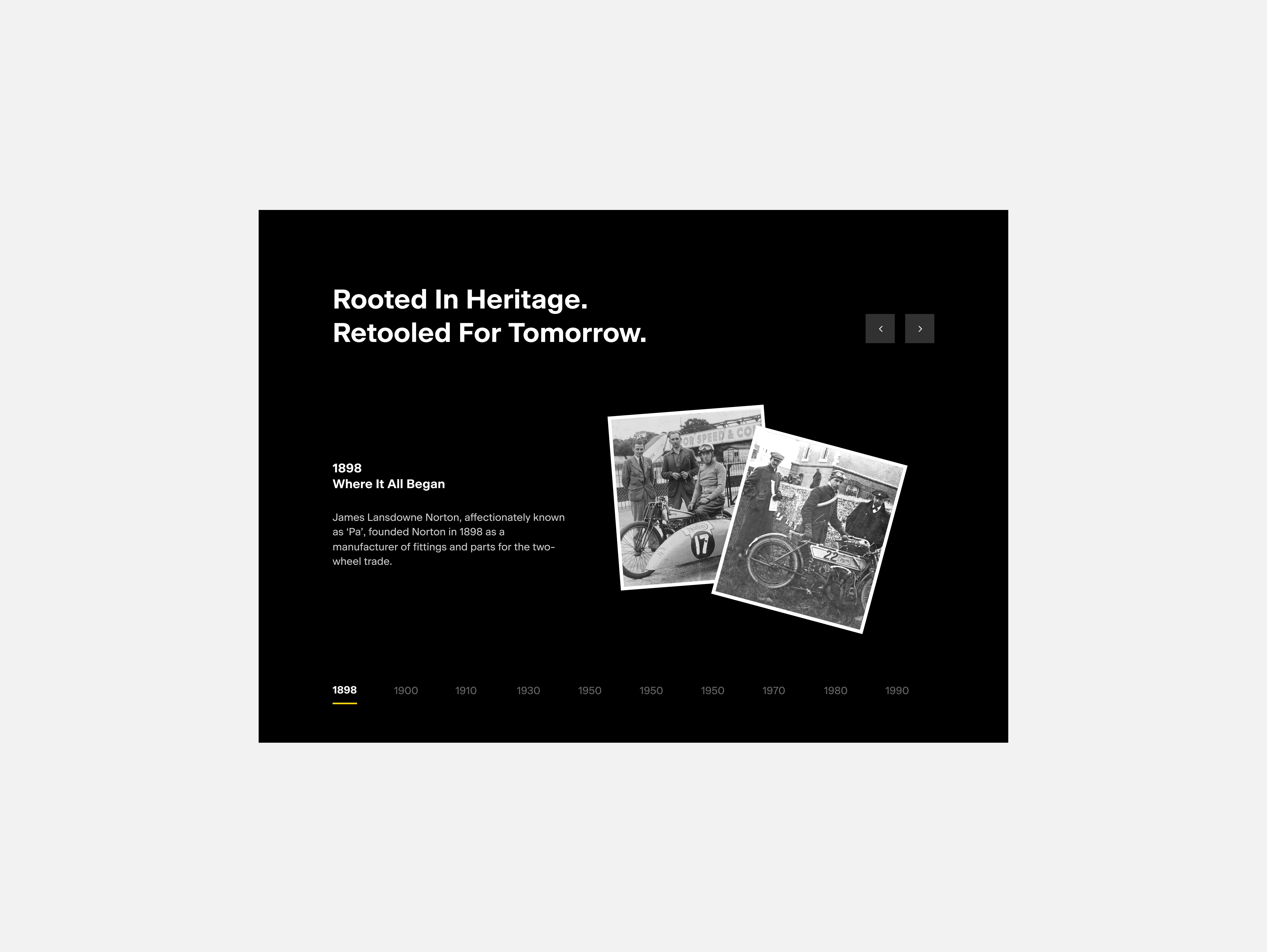
Norton Motorcycles is one of Britain's most storied motorcycle marques, born in Birmingham in 1898. With over a century of racing heritage, Norton has been a symbol of British engineering precision, rebellion, and road dominance from the Manx Grand Prix circuits to the open highways. After years of uncertainty, the brand entered administration in early 2020 and was subsequently acquired by TVS Motor Company, India's third-largest motorcycle manufacturer, in April 2020 a turning point that many saw as the beginning of a true renaissance. When Norton came to us for a complete website revamp, it was more than just a redesign it was a chance to bring a legendary brand back to life online. The challenge was simple but exciting. Our goal is to create a website which showcase the power, the craftsmanship, the heritage of Norton, and make people feel it the moment they land on the website.
Challenge
Norton’s old website had a 72% bounce rate, with less than 0.4% of visitors converting into test ride inquiries. User interviews showed that riders struggled to understand the difference between models and didn’t feel the excitement of the brand when making a decision. The website shared information, but it didn’t inspire.
When Norton came to us for a complete website revamp, it was more than just a redesign it was a chance to bring a legendary brand back to life online. The challenge was simple but exciting. Our goal is to create a website which showcase the power, the craftsmanship, the heritage of Norton, and make people feel it the moment they land on the website.
Competitive Analysis
Learning from competitors, finding our difference
We kicked off with extensive research, studying not just motorcycle brands but also premium lifestyle and tech brands like Apple and Rolex. The UI/UX audit covered everything from color and typography to imagery, motion, micro-interactions, content hierarchy, and emotional storytelling. A few key observations stood out during our discussions:
1. Triumph & BMW : Dark, masculine palettes with clean, grid-based layouts. Their typography felt engineered and functional safe, but slightly conservative.
2. Ducati : A bold signature red creates strong emotional impact, paired with aggressive typography and fast-paced visuals. Cinematic animations, parallax, and scroll-triggered transitions bring a strong sense of speed and energy.
3. Harley-Davidson : Strong lifestyle storytelling supported by warm tones and a distinct brand personality, but the interactions felt less refined compared to newer digital experiences.
4. Apple & Rolex : The gold standards in their categories. Apple delivers seamless, tactile scrolling with thoughtful micro-interactions, while Rolex uses timeless luxury, generous whitespace, and an editorial, magazine-like experience.
These insights helped us define the foundation for the experience we wanted to create one that our team described as “cinematic, fluid, and unmistakably Norton.”

Constraint
We wanted to make the experience more interactive and engaging, but adding too many interactions became a constraint to the overall experience.
After gathering all the insights and discussions, we decided to move forward with a clean and minimal theme along with micro-interactive elements. To make the experience more interactive, we did a lot of competitive analysis to understand what users are actually looking for in an automobile website. We found that features like 3D product showcasing, immersive experiences such as engine sounds, digital speedometer displays, and interactive motorcycle breakdowns can help users feel and understand the product better.
However, adding too many interactions would increase the website’s loading time and directly hamper the overall experience. So, we reduced the interactions to a few key features like 3D models, engine sounds, and overlays that immerse. We retained only those features that genuinely helped users understand and experience the product better. With these focused interactions, we aimed to increase user engagement and time spent on the website, while also encouraging more users to click on the Test Ride and Experience forms.


Design System
We built an expandable design system to maintain consistency, quality, and a cohesive experience across the entire project.
Color Palette: Bold & Restrained : We used a deliberately minimal color palette inspired by Norton’s brand identity that reflects Norton’s design approach sophisticated, bold, and purposeful.
- Core: Black and charcoal backgrounds to create a bold and dramatic feel.
- Accents: White text for clarity, with silver and gray UI elements inspired by the metallic tones of motorcycles.
- Minimal color: Natural bike colors with subtle yellow highlights used only when needed.
Typography: Clear & Distinctive : We used Beausite Classic, a modern sans-serif that balances clarity with character. Bold weights were used for headlines, while Medium and Regular were used for body text. The result is a premium, distinctive look with a subtle geometric and engineered feel, which fits perfectly with the motorcycle brand.
Other than this we also created component library including reusable components like input fields, buttons, breadcrumbs, icons and navbars. To maintain consistency across the pages we also define spacing, grids and corner radius for card edges.


Final Ouput
Key improvements & takeaways
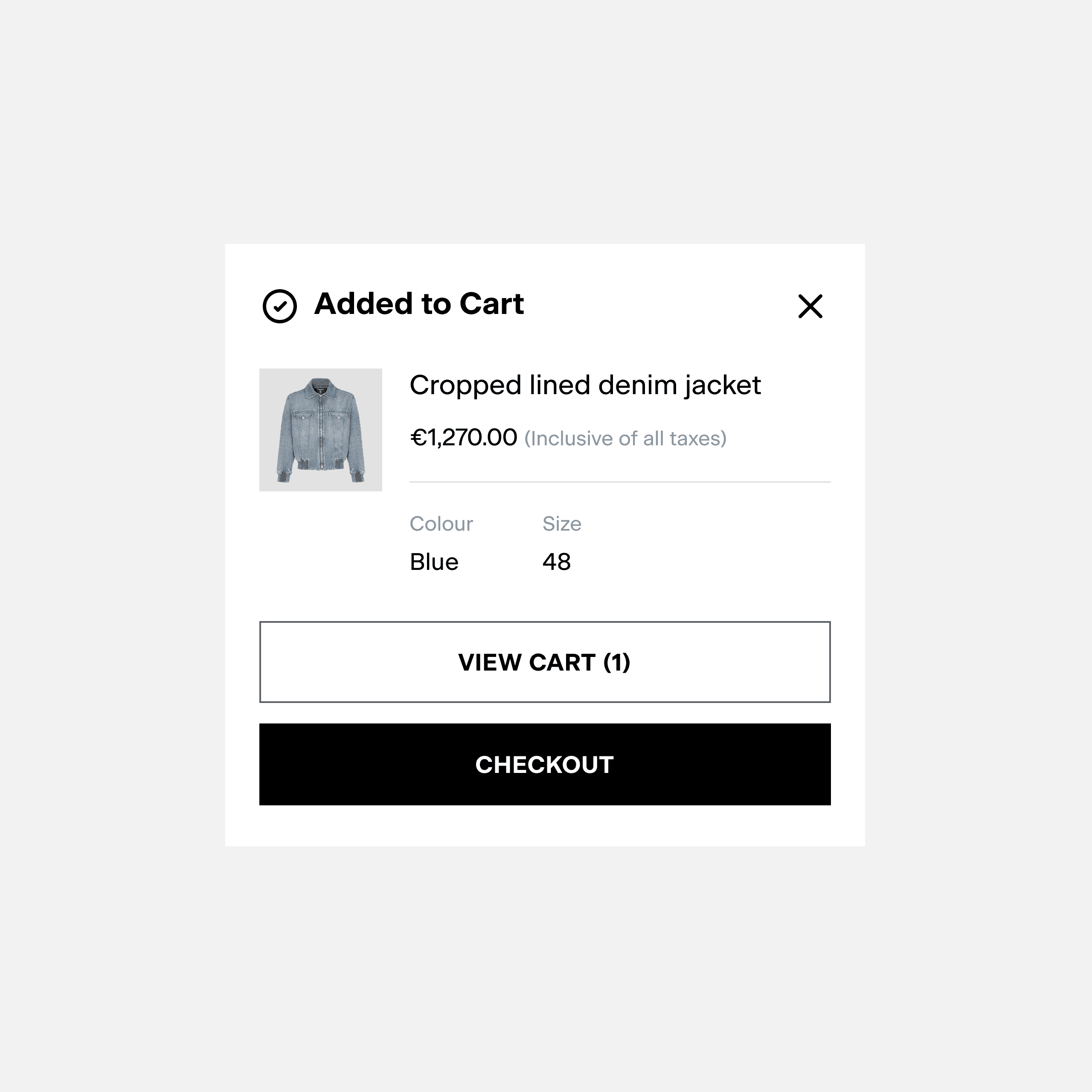
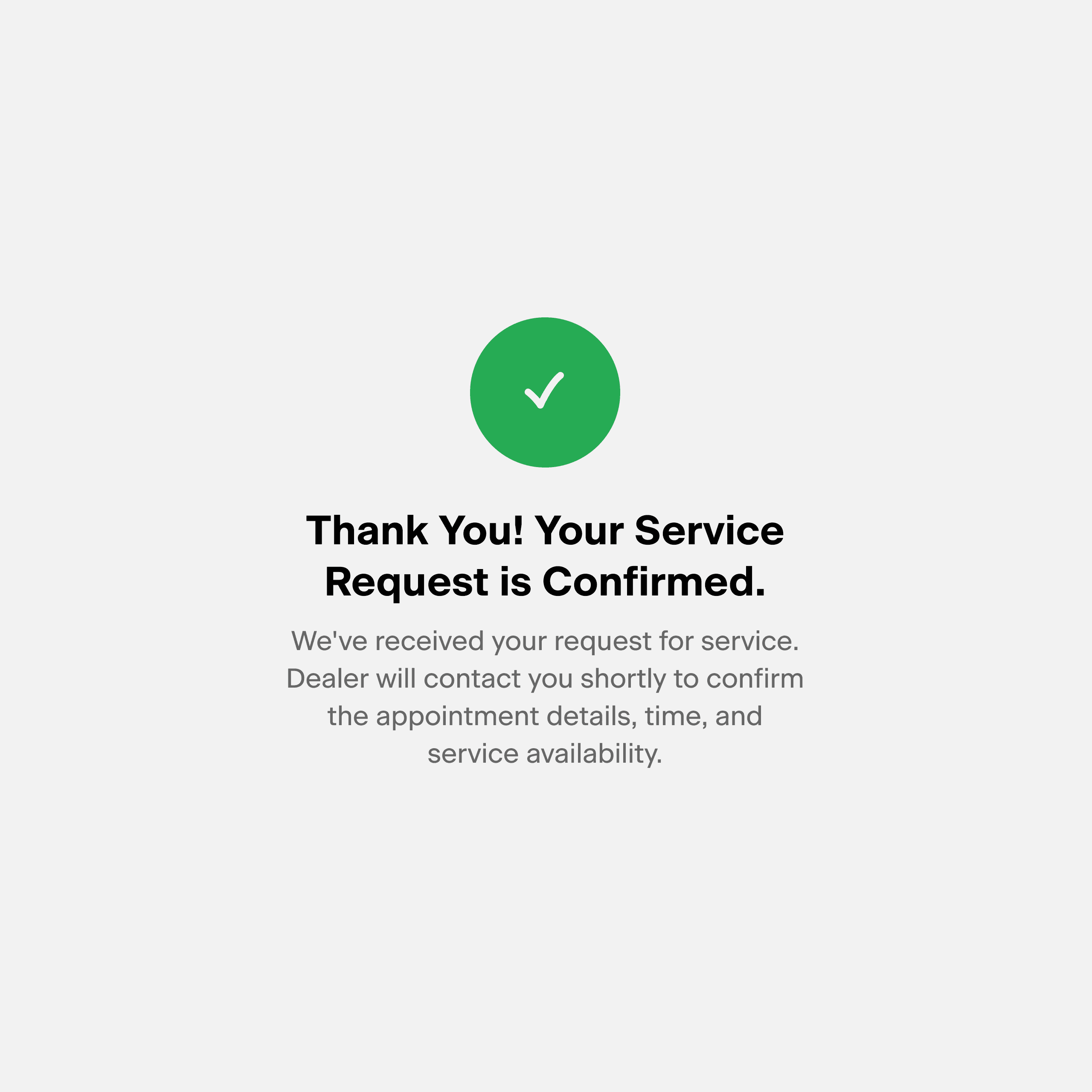
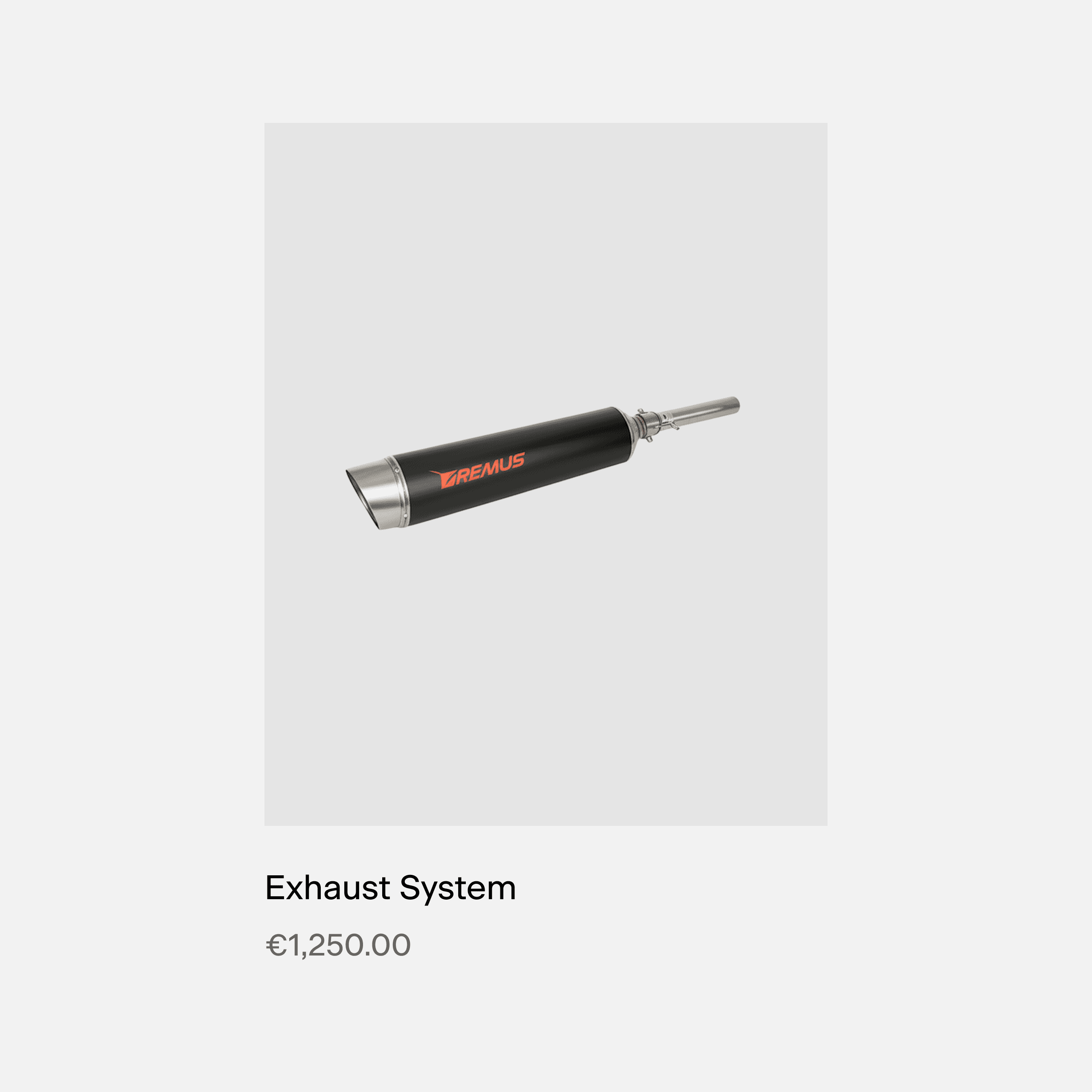
The final screens were designed following the defined guidelines and bringing the overall experience to life. We designed key pages and flows including the Homepage, PDP, Accessories, Merchandise, Forms, Blogs, News, Booking Flow, and Contact. Key Improvements 1. Interactivity: Added 360° product spins, color toggles, sound clips, and technology overlays to help users experience the product. 2. Storytelling: Introduced heritage references, emotional framing, and a clear narrative flow to make the brand more memorable. 3. Cross-selling: Integrated merchandise and accessories into the experience to encourage users to explore more of the Norton lifestyle. 4. CTAs: Replaced the bland closing form with an inspiring closing banner that encourages users to take action. The difference is clear, the old site was mainly informational, while the new is designed to be experiential, engaging, and distinctly Norton.
38%
2.4x
61%
Navigate